Pantone is THE world-reknowned authority on color. And not just because they say so, either. (they do) Industries from advertising to design to fashion to entertainment use the Pantone color-matching system to ensure accuracy. Getting the right color, and the right shade and hue of that color, is vital to the consistency and longevity of your brand identity. Just ask Coca-Cola, IBM, AT&T. Just ask Facebook, who recently tested multiple shades of blue to develop the new “like” button. Color matters.
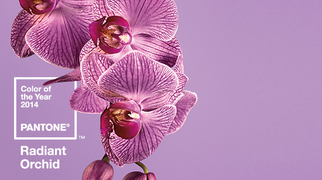
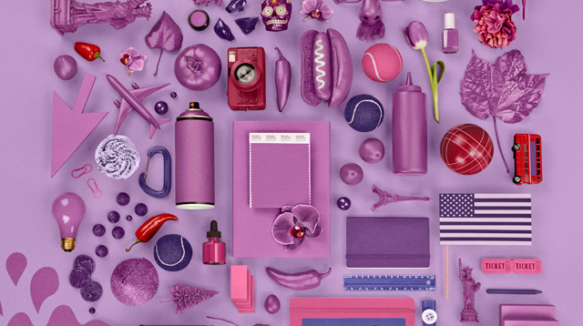
On December 4th, Pantone announced the 2014 Color of the Year, Radiant Orchid. Their press release describes it as a “surprisingly versatile” color that symbolizes innovation, expanded creativity and originality, “which is increasingly valued in today’s society.”This isn’t an arbitrary pick, and it isn’t Pantone trying to manipulate color usage in any arena of business. The process is quite interesting. Here it is, as written by Carmel Lobello of TheWeek.com
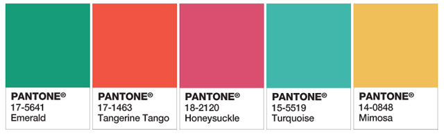
“Each year, Pantone holds a ‘secret meeting’ at a European capital in a purposefully drab, colorless room. Over two days, representatives from different countries’ color-standards groups present and debate their ideas and collectively narrow it down from 2,000-plus to one. Last year they landed on Emerald. The year before it was Tangerine Tango.
“Pantone and its experts consider a variety of factors. Each year they poll graphic, industrial, fashion, and other designers around the world, as well as manufacturers and retailers, asking what colors they plan to use in coming seasons. A color committee made up of Pantone executives and clients makes a pick based on the surveys, sales of color swatches, and its experts’ opinions.”
So the pick is essentially made by designers of all stripes, in all industries. A collective trend identified and amplified by the world’s leading purveyor of color. Below are the Color of the Year picks for the last five years. You’ll notice it’s a very cheery and bright group. What do you think that says about us as a culture?